28 January 2010

Blog Ring: Jewelry by NaLa

Well, I managed to miss last week's featured blog (but see below). Sigh. This week's blog is NaLa: Delicately Elegant Jewelry. Blogger NaLa says of herself, "I'm just a natural born crafter. Jewelry making is not my first venture into the world of crafting, but it is definitely my favorite."

You can see more of her work, and buy some if you're so inclined, in her Etsy shop, Jewelry by NaLa. Here's a piece that caught my eye:


The featured blogger in the other Handmade Artists Forum blog ring this week is Kitzbitz Art Glass, maker of stunning handmade beads. Last week, which I mentioned that I missed, the featured bloggers were fiber/felt artist FiberArtistToo and Bejewelled and Beguiled from Lynwood Jewelry.

27 January 2010

Wednesday Wishlist: LaMech

Part two of promoting art and craft and getting myself blogging regularly is the Wednesday Wishlist. Basically, this is going to be cool, mostly handmade stuff I find online that I would buy for myself if I had the money. Sometimes I will buy them for myself. But if you're looking for gifts for me (hint, hint) here is a good place to start. Or, you know, cool gifts for anyone. Anyone cool, that is.

My first pick is actually something that was near the top of my to-buy-when-I-have-money list, but has now been removed, on account of I'm trading a Flying Machines calendar for one. So don't buy this for me, but do buy it for the other cool people in your life.


This is the Mechanical Companion (LaMech for ladies and GeMech for gents), made by the tremendously talented Haley Moore (aka toenolla) and available for purchase at High London Mechanical. Or if you prefer Etsy, you can also get it there. See more of Haley's work on her deviantART page.

25 January 2010

Monday Multiples: Purple Shore Crab by ploverwing

As part of my efforts to promote art and craft, and to get myself blogging more regularly, I've decided to start a series of more-or-less weekly posts. Actually, I hope to do a couple of series focusing on different things. Monday's post, "Monday Multiples," will focus on printmaking and related disciplines. You might find artist's books in here, though I'll probably have a separate day for those. You may even find the odd one-of-a-kind item (like, say, a monoprint or some other kind of art on paper).

So my very first ever Monday Multiples pick is this Purple Shore Crab by Amie Roman (aka ploverwing) on Etsy.


I really love her whole "BC Bestiary" series, and if I had a bunch of extra cash, I'd buy them all and make a special hand-bound album for them. Or put them all over my wall. She's from Cobble Hill on Vancouver Island, which is almost spitting distance from where I lived in Duncan. Sometimes I miss BC terribly.

Amie Roman is also only of the organizers of Printsy, the Etsy printmaking team, which I recently joined (I'm working on getting better images of my prints to add to the Flickr group). To search for other members, just type "printsy" in the searchbox on Etsy. And if anyone just happens to be gift shopping for me (yeah, I know, it's months till my birthday), you can consider Monday Multiples posts to be part of the Wednesday Wishlist. Which I haven't even posted about yet. Hah!

19 January 2010

Spring Cards: Preliminary Design

I started working on my spring card designs today. I need to pick up some stuff in Halifax next week, and I want to be able to send at least one new card to film while I'm there. Ideally I'd like to send as many as I can fit on an 11 x 17 inch film, but we'll see how much I can get done.

My plan is to do a series of cards featuring Nova Scotia wildlife. I'm starting with birds, since they're around me every day, and they're a popular subject. Despite the fact that it's the middle of winter and my bird feeders are crowded, birds still evoke spring. Anyway, I hope to eventually do four different birds, four plants, and four animals, and maybe expand from there. I originally thought six was a good number, but I have these plastic card sleeves that allow for the customer to see four different designs without having to remove any of them, so four seems to make more sense to start with. Maybe, come to think of it, I should try to do one each of bird, plant (or berry, or flower), tree and animal, to begin with. Or maybe I can do colour themes: bluejay, blueberry, bluebell (are those local?), blue . . . spruce? Heh.

Anyway. Bluejay is the first design I'm tackling, because I have some good photos of my own neighbours to work from. I'll do each card as two plates: one black, and one colour. It limits the design somewhat, but it's not cost effective to do more than two colours for most cards. Obviously, I'll print the bluejay in black and blue.


Here I'm working out where each colour will go. The bluejay is the perfect bird for a two colour print, because they're blue and black and white. Well, OK, and grey, but I can represent that as the white of the paper with some cross-hatching. The branch, being less important, will just be in black.

Next, I'll make two separate drawings from this design and scan them. I'll write more about that later, as I finish each stage and have something to show. I think I'll keep the images fairly lose and sketchy. I have a tendency to try to be too perfect, but I think in this case less formal will be more interesting. Maybe. We shall see.

I've been thinking hard about what other birds to do. If I base them on my own surroundings, I'll probably choose either downy or hairy woodpecker (they're so similar that there's no point in doing both) in black and red, and chickadee in black and beige. But I should probably also remind myself that spring will bring other birds, some of them perhaps more iconic of the province. Which reminds me, I really ought to see what the provincial bird is.

Ah! Osprey. That's cool. I can do him in black and brown. Now, I need to tweak that jay's tail a little bit, and maybe give him more of a standy-uppy crest.

16 January 2010

Blog Ring: Speranza Jewelry

One of the things I've joined in on, in an attempt to meet my goal of promoting craft in general and my own work in particular, is the Handmade Artists Forum Blog Ring. The idea is that one blog is chosen each week, and everyone else in the ring posts about that blog, then posts the link to their post on the forum. Then everyone reads everyone else's posts and comments, and so on. That way, the featured blog gets lots of inbound links, and the bloggers doing the featuring get lots of comments. Both of these things can boost a blog up in Google search, among other things.

This week's featured blog (yes, I'm a little late to the party, but I thought posting later in the week might help spread things out, since most other ring members will post early in the week, if that makes any sense) . . .

Let me start that sentence again. This week's featured blog is Speranza Jewelry. The blog is quite new, with only a few posts, but it looks very promising. The blurb under the blog title says, "My First Year on Etsy – A Blog About Art, Entrepreneurship, and the Handmade Movement," indicating that this could be a very useful and inspirational blog for other crafters just starting out.

Aside from a blog with great potential, Speranza Jewelry also (as you might have already guessed) has an Etsy shop. Here's something really lovely:


As a side note, the HAF Blog Ring is actually two rings. I'm in ring two. This week's featured blog in ring one is Heather's Haven. Also, the blog ring actually started last week, with everyone in a single ring, but I got distracted and forget to post. Last week's blog was Seedlings Jewelry.

10 January 2010

And The Winner Is . . .

I finally got myself organized and chose the winner of the 2010 "Flying Machines: possible and improbable" calendar.


I determined the winner my counting up how many entries each person had and writing their name on that many slips of paper. Then I shuffled the papers, put them in a box and shook it vigorously, opened the box and shook it a little more, than asked my lovely assistant (the fabulous BillyZ) to draw one of the slips.

So without further ado, the winner is Sunshine Folk! Yaaaaaayyyy! (Imagine Kermit the Frog and his arm-flailing enthusiasm--and if you don't know what I'm talking about, get thee to a video rental place and get some old Muppet Show episodes.)

I didn't get the huge response I was secretly hoping for, but I think the contest was successful in its own modest way, and I'm thinking about having another contest sometime in the not too distant future.

If you didn't win, and you're very sad about it, you can still buy a copy of the calendar on Etsy or ArtFire. And if you read this blog, I'll give you a secret free postage discount. Just post here, and I'll make a special Etsy or ArtFire (your choice) listing just for you. There's no time limit on this offer--as long as I have calendars to sell, you can get free shipping by posting here. (If you want to buy several items, let me know and if the postage isn't too high, I'll give you free shipping on your whole order. If the shipping is a bit steep, I'll knock off the cost of the calendar shipping from the total.)

Anyway, THANK YOU!!! to everyone who entered. You guys are the best.

07 January 2010

Winner Coming Soon

Many, many thanks to all who entered my contest! I'll be tallying the entries and posting a winner soon. Whee!

04 January 2010

Tools of the Trade: Quoins and Weights

Some of the smaller tools for bookbinding and printing are things we don't always think about. They're not as exciting or as romantic as century-old presses or handcrafted wooden sewing frames (topics for future posts, I think), and they're not as often in our hands as bone folders or etching needles. But they are dead useful just the same.

Quoins

Pronounced "coins," these little devices are what printers use to lock type in a chase, or cuts on the press bed. Quoins come in a wide variety of types, but I've mostly got one. Later, when I'm back in the printshop, I'll photograph some of the other types.


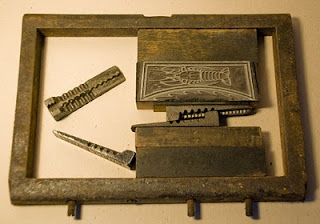
As you can see from the photograph, this type of quoin is made of two separate pieces that fit together. When you use a key (or, in my case, a big screwdriver) you twist them past each other, making them expand in width and put pressure on the furniture (those wood blocks that fill in the extra space between the type and the chase).

I've collected several different brands of this basic type. Each press maker usually also made their own quoins, and in the photograph you can see cast iron versions from Kelsey, Challenge, Warnock and Hempel (I don't know if Warnock or Hempel made presses, but Kelsey and Challenge did). Most of them use friction to stay in place, which is remarkably effective, but the Warnock quoin has a little spring-loaded nub on the inside of each half that pops into dimples on opposing half.


You may have noticed that one of these things is not like the others. It's a bar quoin, in which the parts are joined together. Despite the complexity of construction, it still works the same way. Stick a key in the hole and twist, and the quoin expands (alas, a screwdriver doesn't work on this type, so I've not used it). The advantage of this type is that it only expands in width, and doesn't slide sideways.

Weights


Even less glamourous than quoins are weights, but good weights are essential in a bookbinding shop. They range from bricks wrapped in brown paper, to lead or iron blocks covered in davy board, to specially machined brass.

I'm a little poor in weights at the moment (I've been eyeing the bricks in the garden, but I think I'll have to find a replacement for them before BillyZ will let me have them). I have a couple of very nice chunks of scrap lead that came from a batch of type donated to the Dawson Printshop last year and were rescued from the trash by printmaker and Dawson alumnus Chris Dunnett. We spent an afternoon covering them in davey board (and Chris covered his in bookcloth, too), but then I left them in Joe's studio. Eventually, I'll bring them home.


Here in my own space, I've only got two actual weights. One I just made today. I had a handful of linotype slugs that came locked into the chase of my parlour press when I bought it. Since you can't take linotype apart and reuse the letters, I've just had it sitting around taking up space. Today I finally cut some scrap card and glued it on all six sides of the stack. For fun, I used a scrap piece from the old Dawson packaging on top.

My other weight is an old flat iron that belonged to my grandmother. She had several in her collection. When she passed away last year, Mum asked me what of hers I wanted. I asked for her rock and shell collections, because it was my grandmother who first encouraged me to collect rocks (and my rock tumbler used to be hers, too). Alas, my nephew had already claimed the rocks, but I did get the shells. And I asked for her flat irons. I remember them always decorating her kitchen, which is where we always sat for Sunday tea. I don't know what happened to the rest of them, but Mum managed to snag me one, plus one of the trivets. The iron I have has a lovely smooth wooden handle.


I'm glad to have the things of Gramma's that I have. And not only does the flat iron remind me of her when I look at it, but it's useful, too.

Photo credits, from top to bottom (all by Niko):
  • Chase with a cut and furniture. Normally, you'd use at least two quoins--one to apply vertical pressure and one for horizontal. A second quoin is shown apart.
  • My collection of quoins. I really love the two-piece cast iron ones, and will keep adding to my collection. I suspect the Warnock one might be brass rather than iron, but I'm hesitant to take a file to it to find out.
  • A weight I made from old lines of linotype and scrap card.
  • My grandmother's flat iron, now a book weight in my studio.

01 January 2010

50 Books and 2010 Goals

Some of you may remember a few years back when I picked up a challenge (I no longer recall who the originator of the challenge was, or where online I found it) to read 50 books in the year and blog about it. That first year, I was single and working entirely from home, and I ended up expanding the challenge to 50 fiction, 50 non-fiction, and 50 graphic novels, and still beating it easily.

So this year I've decided to change things (though I'm not single anymore, and often drive for more than an hour to get to the printshop, which will cut down on my free time). I'll still aim for reading 50 books (and maybe, if it goes well, for 50 fiction, non-fiction and comics). But this year, I'm going to try to bind 50 books.


While I don't count books I've already started in my reading 50 books challenge, I think I will include books started in my binding 50 books challenge, as incentive for me to finish the projects I've started and not finished over the past couple of years. So yeah, this year I aim to bind (at least) 50 books, and I'll blog them here.

And as for 2010 goals, I don't usually make actual New Year's Resolutions, but I do like to start the year with some general goals. This year, besides the 50 books thing, my goals are:

  • take White Raven Ink seriously as a business, including registering the name, working on marketing, developing product, getting the website finsihed, etc
  • finish, or at least get a bunch more done, Fey: Drawing Borders
  • seriously get back into writing fiction (and maybe even finish White Foxes, Full Moon), including submitting stories and further exploring the possibilities of POD, and writing The Fabulous Forays of Aeryn Daring as an illustrated serial novel
  • work on illustration, including furthering my skills in Photoshop and Illustrator--one of the projects I'll be doing is full-colour Photoshop illos for Aeryn
  • work on organizing and cataloging my backlog of photographs
  • get a portfolio together for Viewpoint Gallery and apply for membership
  • apply for at least one show
  • become more active online (one selected sites) in order to network and market my work
  • make some time to play video games for fun (and not just for work)

Well, I think that's enough for now. Like I said, they're fairly general goals, but that makes them more feasible. 2009 was a pretty good year for me professionally (plus I bought a house!); I'd like 2010 to be even better.


Photos: Top - Copper Manuscript of the Hill People of Frisland. Copper-covered coptic stitch book with Japanese paper pages, hand-done calligraphy and illustrations. Photo and art by Niko.

Bottom - Sneak-preview back cover of an in-progress POD book project (and possible gallery show) called Taxonomy gastronomica (Silvester). Photos and design by Niko.

31 December 2009

We Had The Neighbours Over for Lunch


I've been meaning to post more about the house, but somehow other things kept taking precedence. Today was such a good day for avian neighbours, though, that I was finally prompted to blog.


With the exception of bald eagles and ravens, who tend to fly overhead but not stop in, I saw every kind of bird today that I had seen at the the house so far, plus a couple of new visitors.


We have two suet feeders, which are frequented by black-capped chickadees, bluejays and downy woodpeckers. We've had large flocks of chickadees, who are entirely fearless and cheerful little birds. I can't say how many have visited at once, because they don't stay still long enough to count. As for bluejays--who like both the suet and the loose seeds--we usually get five or six at a time, but I've seen as many as twelve flitting about the yard at once.


The downys tend to stop by singly, but there are at least two of them; we've spotted a male and a female (the males have a red spot on the back of their head). There is a flock of mourning doves who visit the loose seed (and who will even chase off the bluejays, if they get too obnoxious). The number varies, but I think there may be six or seven altogether.


There are also at least two crows who visit regularly, but unlike city birds, they're quite shy and keep their distance from the house. They fly into the trees if anyone goes outside, but I think they're beginning to figure out that a person outside often means tasty things to eat. One of them is a relatively small bird, and the other is so large I keep checking the shape of his (or her) tail to make sure it is actually a big crow, and not a small raven.


Today, I glanced out the window and saw--to my surprise and delight--that the black and white, red head-spotted woodpecker clinging to the nearest suet feeder was much larger than our usual downy visitors. It was a shyer bird, a hairy woodpecker. He sat and ate off one feeder while the little female downy had her lunch on the other. I ran upstairs to get my camera, but he flew off just as I was adjusting the focus (which is what also happened with the crow photo, except I managed to snap a poorly exposed pic of him flying away).

The other new visitors were three (or maybe more) tree sparrows. They look much like house sparrows, except they have very reddish brown heads and eye-stripes. According to my bird book, they're winter visitors. They didn't pay any attention to the suet, but instead hopped around pecking at the remnants of the seeds left by the jays.

I also experimented with some leftover bacon grease from this morning's breakfast. I always hate to just throw it away, as it seems like something the local wildlife would enjoy. So this afternoon I mixed a bunch of bird seed into it and made it into a sort of mushy cake on a scrap of wood, then put it out on the picnic table to see what would happen. The bluejays loved it. They don't always like to get so close to the window when we're right inside watching, but there were as many as five at a time pecking at the bacon seedcake. So now I have a use for bacon grease.


Photos, from top to bottom (all by Niko):
  • Bluejay on a suet feeder.
  • Black-capped chickadee on one of the suet feeders, on the table because too many bluejays at once broke the hanging chain.
  • Female downy woodpecker on suet feeder
  • Male downy woodpecker on suet feeder, restored to its hanging position with the help of some twine
  • A bluejay and a mourning dove (look close, she's brown and hard to spot)
  • Crow, who decided he didn't like the look of my camera and flew away as I was pressing the shutter release
  • A bluejay laying claim to the bacon seedcake.

27 December 2009

Contest! Win a Flying Machines Calendar


A contest seems like a nice way to finish off one year and begin another, so from now until January 6th, I'm going to run a contest here on my blog. Those of you who've entered blog contests before will be familiar with the format. The more you help me spread the word about my blog and my shops, the more entries you get.

Things that will get you one entry each:

  • choose your favorite item from one of my shops (Etsy here and here, ArtFire here) and leave a comment on this blog post

  • heart one of my Etsy shops

  • choose your favorite post from this blog and mention it in a comment

  • follow my blog

  • follow me on Twitter (@anagramforink)

  • retweet the Twitter post announcing this contest

  • become a fan of my Facebook page

  • recommend my Facebook page to your friends

  • watch me on deviantArt, or fave one of my deviations


If you buy something in one of my shops, you'll get two entries; spend $50 or more and get five entries. Make sure you post a comment here letting me know what you did, so I won't miss any. Also make sure your email address is in your post or your profile so I can contact you if you win.

The prize: one of only 30 hand-printed letterpress flying machine 2010 calendars. See this blog post for more photos and info on how I printed it, and find it here and here in my online shops.

In the delightful but unlikely event that I get lots of people entering, I'll add another prize. If lots and lots enter, I'll add a third prize, and so on. (As for how many = "lots," I'm not really sure. 25? 30? Some number dependent on whim? Probably.)

19 December 2009

2010 Flying Machines Calendar!

On Tuesday I finished the last printing I needed to get done before the new year: my 2010 "Flying Machines: possible and improbable" calendar.


On Thursday I trimmed, hole-punched and packaged all 30 of them, and of course signed and numbered them. I had already pre-sold two at the Halifax Crafter's Market, and had two other people interested in buying when they were finished. So I've now sold 5, will keep one for my files, and will probably use 5 or so for gifts. So that leaves 19 for sale in my Etsy shop and my ArtFire shop.

The calendars are printed on one of my favourite (non-handmade) papers for letterpress: Mohawk Via Vellum 80 lb cover. The 100 lb is nice, too, but doesn't fold as well for greeting cards, so I usually buy the 80. The vellum finish gives it a soft texture that doesn't interfere with the printing as heavily textured papers sometimes do. I chose warm white for this, rather than my usual cool white--although cool white tends to have less affect on the ink colour, the warm white seemed better suited to the subject matter, and goes well with the brown ink.

I printed the names of the months first, using a different historic wood type from the Dawson Printshop's collection for each month. I added a lot of transparent base to the ink, and printed relatively lightly in order to get all the texture and imperfections of the old wooden type to show up. For printing the wood type, I used the shop's Vandercook Universal 1 proof press.

Then I printed the numbers and the images at the same time, from polymer plates. I used quite a bit of packing on the cylinder to bring up the pressure and get a nice deep embossment (technically debossment, I suppose). The letters for the days of the week were printed the same way, only with a different colour of ink, of course. The polymer plates were all printed on the shop's Vandercook Universal 2 proof press, a very rare press (apparently only 50 or so were made).

All of the images except two are ones that I found in my various history of flight books (I have a small collections). Many of them are Victorian, and a few of them were in full colour, which meant I had to remove the colour in Photoshop before converting the files to vectors. The two images that weren't ones from my own books came from a file of miscellaneous images on the Printshop computer. Some of the machines pictured actually flew, while others are simply exercises in imaginations.

I'm going to post a contest here soon, where you'll be able to win a copy of the calendar. I think what I'll do is make it a trivia contest, where you'll have to identify some of the machines--maybe which ones actually flew, for example. More on that very soon.

16 December 2009

Letterpress, Not Screen Print

Despite the many print jobs I've had in the past few weeks, I still managed to design and print two new holiday cards. Well, I cheated a little on the design, and took one of the motifs from my first design, enlarged it, added to it a little, and printed it on its own.

I started by drawing the images by hand, then I scanned them and opened the files in Illustrator. I used live trace to convert the images to vectors, which generally print much better than, say Photoshop files. Once I was happy with the designs, I had to separate the colours (which was easy since I only used two colours in one card and one for the other, so all I had to do was select the relevant parts and drag them to a new file), then convert everything to registration black.

Registration black--that is, black that will be printed with CM and Y as well as K, and not just the black ink cartridge--is necessary to make the negative dense enough to block light. I send my files off to a pre-press guy, who sends me back a negative. I cut the pieces for the different plates apart and then use a platemaker to create the images on polymer. After washing with soft brushes to remove the unexposed polymer, the plates are dried and then cured in the sun. I leave them to cure for at least 24 hours before printing.

I tried to print the single reindeer card with a split fountain (there's no actual ink fountain on the press, but it's basically using two--or more--colours on the same press; in litho class we called it a "rainbow roll"), and you can see from the photo that it looks great on the rollers and even on the plate. Look at the image of all the printed cards, though, and you can see that they dried in a solid grey-blue. I'm still not sure quite why that happened.


I also printed a two-colour card with 3 reindeer, but neglected to photograph it in process.

Interestingly, everyone who saw the reindeer card at the craft fair thought it was either a screenprint or a die-cut until I showed them how the relief printing created an embossed effect where the white deer shape is raised above the surface because the coloured areas were pressed into the paper with so much pressure. I guess I have to learn how to design letterpress images that look like letterpress.

Photo credits: Top = polymer plates for holiday cards and 2010 calendar. Second = two inks at once on the press and the plate. Third = a whole pile of reindeer cards, printed and drying. Bottom = my booth at the Halifax Crafter's Christmas Fair. A little crowded, but each time it looks a little better. All photos by Niko Silvester, taken with an iPhone.

Experiments In Coptic Binding

One of the jobs that's kept me so busy these past few weeks was a binding job for a friend of mine to give as a gift. (I won't mention who the friend is or who the gift was for, on the slender chance that the surprise could be spoiled. I don't think the recipient is likely to come across my blog, but you never know).

The specifications were for a journal, with reasonably nice writing paper (nothing expensive) and a leather cover, with the recipient's initials blind-tooled on the front. My friend found an image of some journals she liked the look of--the spine wasn't visible in the photograph she sent, but they were either Coptic or longstitch (an evolution of Coptic), with exposed stitching on the spines. I've done similar books before, though with hard covers rather than limp leather.

I used Classic Laid paper for the text block (for those who don't do books, "text block" is the stack of pages, regardless of whether or not they actually have text on them). It's kind of the go-to paper for anyone who learned binding with Joe Landry. It's relatively inexpensive, but has a traditional-looking laid finish and feels quite nice. And though it's textured, it's not so textured that it's difficult to write or draw on.

For the cover I got some very nice, but also inexpensive, chocolate-brown cow leather. With this kind of cover, you need a thicker leather than you would use on a hardcover with leather spine. The leather itself is both the cover and the sewing support, so it needs to be strong.

I laid out and punched the sewing holes for longstitch, then went looking for a diagram to refresh my memory of the sewing pattern. And of course I couldn't find one. Not in my books and not online. And I seem to have mislaid some of my binding notes. While looking online, though, I found a really nice Coptic stitch that uses two needles for each thread, and a separate thread for each pair of holes. It turned out to be even better for the sewing holes I'd punched than my original idea.

I made a practice book first, since I hadn't done one quite like it before (it's the top one in the photo). Then I went on to the real thing, after deciding to do three pairs of holes instead of two (because of the larger size). I ended up juggling six needles at once, but I think the result was worth it. And my friend was very happy when she got the book in the mail (it's the bottom one in the photo).

I had the practice book on my table at the Halifax Crafter's Christmas Market, but I was not at all sad when it didn't sell. I've had my eye on it myself to use as a naturalist journal. Of course, I could always make another one.

Photo credit: Coptic stitch blank journals bound and photographed by Niko Silvester.

18 November 2009

Another One Down

Yesterday I finished off another print job. This time it was 500 business cards and 1000 hang tags for Lesley Armstrong, a Halifax textiles artist. Even printing two-up, it was a big job and would normally have taken four days of printing, plus a day or so of prep and finishing. As it turned out, the "soon, but there's no rush" timeframe I was initially given was actually more like "right now, but Tuesday will have to do" (from now on, I'm going to insist on actual completion dates). In order to get it done on time, I condensed four printing days into three (thankfully, there were no big problems), and printed on the weekend, which I don't normally do.

While I was finishing the job, I thought a lot about the difference between "perfect" and "acceptable." Usually, I like them to be the same thing. But when printing a big job on a press not known for its accuracy of registration, the difference between perfect and acceptable gets bigger. I always print more than the actual number required, but sometimes it still comes down to weeding out the worst misprints and leaving the rest in. Of course, I'm talking about prints off-register by less than a millimetre, but I can see it's not perfect, and it bugs me.

Another factor, though, is the "handmade factor." When something is handmade, clients want it to look handmade (without being shoddy). A perfect letterpress print by the old definition would be indistinguishable from a digital print, except the printing would be denser, and perhaps softer on the edges. These days, though, the appeal of letterpress is its ability to impress the type or image right into the paper. You can feel letterpress. And the imperfections that would once have been rejected become interesting.

I was speaking about just this concept with Vince (former Dawson co-manager) during his visit from Kingston last week. He commented that people want some of that imperfect look, and I suggested that maybe we need to start thinking of printing from polymer plates the same way we think of wood type--the imperfections will happen and maybe we shouldn't try so hard to get rid of them (with old wood type, it's often impossible to get a perfect print, anyway).

So I finished the Armstrong Textiles job on Tuesday when I weeded out misprints, clean up a few ink smudges, and did the final trim. Oh, and hole-punched all 1000 hand tags by hand. Ouch! Today I finally started on the binding job that's next on the list, sent a quote off for the NSCAD President's Chistmas cards (to be printed next week, most likely), and caught up on some paperwork. I even got an article for Handmade News done (on how to make a little book from a single sheet of paper--it'll go live tomorrow), blogged for About PSP, and tidied my worktables. The studio is still a mess, but it's just a teeny bit less of a mess.

Tomorrow I need to finish a PSP article and maybe get started on a review, and finish prepping the digital files for my calendar and holiday card so I can send them to film on Friday.

Photos (all by Niko): Top - Vandercook Universal 1 proof press inked up in green. There's a little polymer plate on there, ready to print the second colour on the hang tags for Lesley Armstrong.

Middle 2 - Armstong Textiles hang tags and business cards, 4 to a page.

Bottom - A colourful beetle that landed on the ground in front of me while I was taking the air just outside my house.

11 November 2009

One Down

I was going to photograph the order for Halifax stationery shop Duly Noted and post it here, but in my zeal to get the job wrapped up tonight, I packed and bagged the whole lot before I remembered. They ordered three dozen each of four different cards--two are designs by former Dawson co-manager Vincent Perez, one is a design by other former Dawson co-manager Carley Colclough, and one is printed from an old cut.


I also wrote and queued up an article on paper grain for Handmade News. I'm turning my bookbinding "inspiration" column Leaf by Leaf into more of a how-to and have re-located it to the Craft Techniques department. It'll go live tomorrow.

Then there were the usual house odds and ends. My studio space is still a disaster. Maybe I'll have some energy when I get home from the printshop tomorrow to organize a bit. Though I also have to start my "Hot Holiday Games for PSP" article.

Photos by Niko of cards designed by Vincent Perez.

09 November 2009

Or Falling Off a Bicycle

Well, I managed to do pretty well with keeping up on my NaNoWriMo word counts. Until Friday. I missed a couple of days, but managed to get caught back up again. Then came Friday, and snow, and a full day in the printshop, and driving home in the dark and wind. I was both tense and limp by the time I got in the door. I managed to feed myself some leftovers and then collapsed on the couch next to Bill, who'd had an even worse day of driving than me--his driver's side windshield wiper went on the way in the school and he had to drive leaning over to look out the passenger side. To his credit, he made it to school, did the whole day and made it home again.

And the weekend was full of house things and driving back and forth to Truro trying to get the right bits to install the new faucet, and again no writing happened. So anyway, I'm three days behind on writing, which is really just a point of pride. There's nothing saying I have to complete NaNoWriMo, but I'd really like to. And of course, today is such a perfect day that I've had a really hard time keeping myself inside working. There's a gate that needed disassembling, so I could have the boards to put up a shelf, you see. And now I really want to go out a snap a photo of a mushroom I spied in the undergrowth near the driveway, and I have to move those last couple of gate boards up next to the house, and, and, and.

In other news, I'm working on a fairly large job printing business cards and hang tags for a textiles artist. I had hoped to get started on that today, but getting Bill to school takes precedence over getting me to the printshop. He should have his truck sorted out by tomorrow, though, so I'll head down then. The polymer plates are ready, and they look pretty good. Some of the type is quite small, but I've printed type that small before and haven't had too many problems. So main issue is going to be the pressure on the press. The Vandercook Universal 2 that's in the shop has developed a problem where the press bed won't drop as far as it should, no matter how you crank it. By using very little packing, it's still possible to print polymer plates--as long as the paper isn't too thick. I'll be printing on textured card stock, so I hope that I'll be able to get the pressure to cooperate. Otherwise I'll have to print on the Universal 1 in the Design shop. Which I actually like better, but I'll be more likely to be in the way of some class or another, and the Universal 1 has issues of its own.

(Photo: the Dawson Printshop's Vandercook Universal 2 proof press, before it developed press bed pressure adjustment problems. Photo by Niko.)

Anyway, if I can get that job started tomorrow, I might be able to finish it by the end of the week. Then it'll be back to holiday cards, a 2010 calendar, and book jewelry. And maybe a couple of really fantastic blank journals. Oh yeah, and a binding job. I'll need to start that this week, too.

01 November 2009

Like Riding a Bicycle

I haven't written much fiction at all in quite a long time, and that's not a good thing. I've sort of been making up for it by reading a lot, but reading fiction is not the same as writing fiction.

So I signed up for NaNoWriMo this year, hoping to kick-start myself into fiction writing again. With so many other things on the go, I'm not sure I'll manage the 50,000 words by the end of the month, but I'm at 1711 so far, which is just a little over the necessary 1667 a day to reach the goal and "win" NaNoWriMo.

It wasn't until I actually sat down to write this evening that I actually decided what to work on. I didn't really want to work on White Foxes, even though I really would like to finally get it done. I wanted something I could start and finish, not something I was halfway through, even though I'm pretty sure there are well over 50,000 words left to go in White Foxes. I considered writing the second book in the Kentaurs series (I wrote the first one last time I did NaNoWriMo), but I don't really know what happens yet--not even how it begins, except that Octavian goes looking for his brother Archer.

But then I remembered that I had been thinking about making The Fabulous Forays of Aeryn Daring into an illustrated serial novel instead of a comic (hypothetically leaving me more time to work on the long-time-in-progress Fey comic). It's something I already had a beginning for (though in a very different form), notes for the near future of, and a general idea of where it was headed. I suspect it may grow into a series of short serial novels, but I won't know until I get there, I guess. So, 1711 words and it's pretty silly, but I'm having fun and it means that anyone who has actually been reading Aeryn on webcomicsnation might actually have something new to read soon. Cool.

I've attempted NaNoWriMo three times before now, in 2003, 2004 and 2005. The first two times I did really well, ending up with The Secret Common-Wealth (a faery story) and The Madness of Kentaurs (an alternate-world fantasy), both YA novels and both well over 50,000 words. The third time was the year I started at NSCAD and I realized almost immediately that it was a really bad idea to try to do end of term projects, and write a novel. The end of term projects alone almost did me in. So, I know I'm capable, at least.

Here's to hastily written novels!

30 October 2009

Catalogues for Sandra Brownlee

I'm supposed to be printing cards today. A Halifax stationery store, Duly Noted, is patiently waiting for an order they put in several weeks ago. Alas, today the car decided not to start. In fact, it didn't even seem to try to start. I'm hoping it's something simple that BillyZ will fix in five minutes after he gets home this evening, but in the meantime, I'm not printing.

I'd have had the order finished a couple of weeks ago, if not for a couple of rush jobs that I didn't feel I could turn down (not to mention that the extra income is very welcome since we just bought a house). The first job was the certificates for the Lieutenant Governor of Nova Scotia’s Masterwork Award. (How could I say, "No," to the Lieutenant Governor?) The design had mostly already been completed when the Dawson Printshop printed last year's certificates (I was in Pennsylvania for a few weeks when that happened). Former Dawsonite Carley Colclough did the rest of the design long distance from BC, and then I made the polymer plates and did the printing.

I miscalculated a little when getting the paper together; the paper was from the Colours line by Papeterie St Armand, which is rather smaller than most of the stock we use. And the certificates are quite large. I had thought I would get four certificates from each sheet, but was only able to get two. This meant I didn't have enough paper to make many mistakes. I cut a lot of scrap for testing and re-used some of last year's discards. I managed to print all six certificates (the five finalists and one winner) without a single mishap, which has to be a record, considering it was a four-colour job. It was nerve-wracking, to say the least. I'm very proud to have printed something that will have the Lieutenant Governor's signature on it.

The second rush job was binding the exhibition catalogues for Sandra Brownlee's show at the Mary E. Black Gallery. The show is called Departures and Returns and is on right now, so if you're in Halifax be sure to check it out. It's textiles, but her notebooks are also on display, so there's something there for book people, too.

A few of the 72 softcover catalogues had already been sewn, but I did most of them. Then I had to glue on an inner cover--it's like a wraparound cover you'd see on a paperback, but instead of being the actual cover, it's what the dustjacket wraps around. Then I had to tip in a plate to each copy and fold and install the dustjackets. It took me two full days of work to do all 72--good thing I sew fast. And I was very happy that the books all had their sewing holes punched already, which saved me some time.

On Monday afternoon as I was sewing the catalogues, I got a slightly panicked call from Sandra. She'd decided she was really unhappy with the cover size of the deluxe edition of the catalogue (which I wasn't working on), and wanted to know if I'd be able to help put them together if she changed the size. So Wednesday I drove to Joe's studio where Joe and I and a couple textiles friends of Sandra's worked on covering and attaching the new boards. The originals had been made larger to accommodate some weavings Sandra wanting to include. She decided to re-do the weavings at a smaller size, so the covers could be made to a size that fit the pages of the catalogue. We completed 12 of the 30 in the deluxe edition, which was plenty for the show's opening--Sandra can finish the rest at her leisure now that the show is installed and opened.

So today I was meant to be in the printshop, printing, but am not. Instead, I'll get the files ready to send to film to make the polymer plates for this year's calendar (flying machines! wood type! days of the week!), and I'll start on the next batch of tiny book jewelry (the Japanese-style binding, as I have to get more materials for the European-style ones) for the Halifax Crafters fair in early December. And perhaps I'll make some paste and get to work backing some suede with kozuke for another batch of mini SteamBooks. Maybe I'll even make a couple of larger ones this time.

And maybe, just maybe, I'll get a bit of work done on the website and do some writing. but that is probably wishful thinking. Oh hey, it's almost November. I have to decide if I'm going to attempt NaNoWriMo this year. Now that I'm not in school, it might be an achievable goal. And I really need to get writing fiction again.

05 October 2009

Moving to the Country

I meant to have a nice detailed blog about the house--I even took a bunch of pictures--but since we have less than two weeks now to finish packing everything and get it to the house, and I'm working on a print job (meaning I have to be back and forth to the printshop), and the usual writing work, I haven't had time. Plus when I have had a moment free, we've been at the house, where there is no internet yet. So you'll just have to wait for the big house post. In the meantime, here's the outside.


It doesn't look like much, but oh do we have plans. It's solid, and that's the main thing (well, except for that deck, which needs jacking up and new boards). What we really fell in love with was the property--four acres of trees and meadow. And a cave.


It's a small cave in the gypsum bedrock, but a cave nontheless. Water trickles out of it, and cool air even in the heat of summer. And I met this lovely fellow there:


Naturally, I didn't get too close. I was close enough, though, that I learned porcupines talk to themselves as they trundle along.